> ## Documentation Index
> Fetch the complete documentation index at: https://makeswift-sasha-eng-8460-create-a-guide-for-troubleshooting.mintlify.site/llms.txt
> Use this file to discover all available pages before exploring further.
# Color
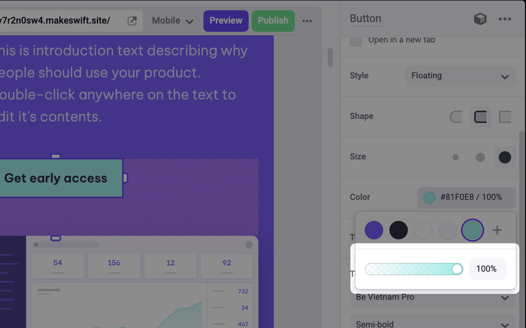
> Adds a Color picker panel in the Makeswift builder to visually edit a RGBA `string` prop.
## Params
Text for the panel label in the Makeswift builder.
Position for the color label within the panel.
The value passed to your component when nothing is set in the Makeswift
builder. Must be a valid CSS color string.
Indicates whether to hide the alpha channel slider.
## Prop type
The Color control passes a `string` RGBA value to your component. If you don't set a `defaultValue` and no value is set in the builder, your component will receive `undefined`.
## Example
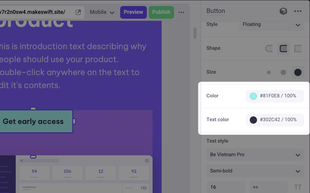
The following examples adds two Color controls to the `backgroundColor` and `color` props of a Button component.
### Using inline styles
```tsx Button.makeswift.ts
import { Color } from "@makeswift/runtime/controls"
import { runtime } from "@/makeswift/runtime"
import { Button } from "./Button"
runtime.registerComponent(Button, {
type: "button",
label: "Button",
props: {
backgroundColor: Color({
label: "Background color",
defaultValue: "black",
}),
color: Color({
label: "Text color",
defaultValue: "white",
}),
},
})
```
```tsx Button.tsx
interface Props {
backgroundColor?: string
color?: string
}
export function Button({ backgroundColor, color }: Props) {
return (
)
}
```
### Using CSS variables
```tsx Button.makeswift.ts
import { Color } from "@makeswift/runtime/controls"
import { runtime } from "@/lib/makeswift/runtime"
import { Button } from "./Button"
runtime.registerComponent(Button, {
type: "button",
label: "Button",
props: {
backgroundColor: Color({
label: "Background color",
defaultValue: "black",
}),
color: Color({
label: "Text color",
defaultValue: "white",
}),
},
})
```
```tsx Button.tsx
import { CSSProperties } from "react"
interface Props {
backgroundColor?: string
color?: string
}
export function Button({ backgroundColor, color }: Props) {
return (
)
}
```
`.makeswift.ts` is a naming convention for organizing Makeswift registration
code. [Learn
more](/developer/reference/runtime/register-component#organizing-registration-code).
 ## Params